An increasing number of journals ask that authors prepare a graphical abstract (a visual summary of their main findings) to accompany their paper's title in the issue's table of contents. This may seem a daunting and time-consuming task to a harried author, but a graphical abstract doesn’t need to be a piece of amazing artistic prowess or even a complex schematic – in fact, the simpler the better! A simple and effective graphical abstract is a fantastic way of drawing attention to your paper, particularly in the crowded social media marketplace.
As the Editorial Manager of FEBS Open Bio, I get to see all manner of graphical abstracts, the most eye-catching of which all follow general principles of good design. Here are five points to consider when designing your next graphical abstract, illustrated using examples taken from articles recently published in FEBS Press journals:
1. Use colour and tone with intent
i) Use colour to convey meaning. Colour should not be used at random – use colour to direct the viewer’s attention to the most important points. A switch to a different colour should be used to represent a change or distinction: for example, two different colours could be used to represent two different cell lines or a cell before and after treatment.
ii) Pick colour carefully. Choose your colours with care by considering the colour wheel. Colours that are on opposite sides of the colour wheel (such as red and green) are complementary and provide a vibrant contrast: this is effective if you want to emphasise a change. On the other hand, colours that are adjacent to each other on the colour wheel (e.g. blue and green) are considered analogous; while analogous colours are harmonious, they may lack sufficient contrast.
iii) Tone is important too. Remember to also consider the tones (how light or dark a colour is): to do so, convert your graphical abstract to greyscale using image editing software. Different colours may have similar tones, and thus appear similar in black and white. If text has the same tone as the background colour, it will be hard to see - make sure you use different tones for foreground and background elements so that the former stand out.
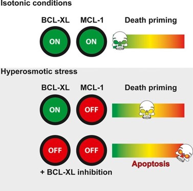
Colour is used very effectively in this graphical abstract. The green and red are complementary colours and provide a vivid contrast between the on and off conditions. On the right, the gradient from a cool colour (green) to a warm colour (red) visually conveys that the described effect exists along a spectrum.
FEBS J. 2020 Jul 25. doi: 10.1111/febs.15492. Online ahead of print. Hypertonicity counteracts MCL-1 and renders BCL-XL a synthetic lethal target in head and neck cancer. Sina Heimer, Gertrud Knoll, Patrick Neubert, Karin P Hammer, Stefan Wagner, Richard J Bauer, Jonathan Jantsch, Martin Ehrenschwender. Link to graphical abstract
2. Use as few words as possible
The focus of a graphical abstract should be the images – if your graphical abstract doesn’t make sense without reams of accompanying text, you’re doing it wrong.
i) Use pictures to depict things wherever possible. If necessary, use text to label the image (e.g. you could label a cartoon of a cell with the text ‘HeLa’).
ii) Use arrows. Instead of adding words such as ‘enhance’ or ‘decrease’, consider using up or down arrows (the width of the arrow can also be used to represent the size of the effect).
iii) Consider the size of the text. Is the text clear, even at a reduced size? (Remember, someone might be viewing your graphical abstract on their phone.)
iv) Consider the font. Use a sans serif font to improve readability.
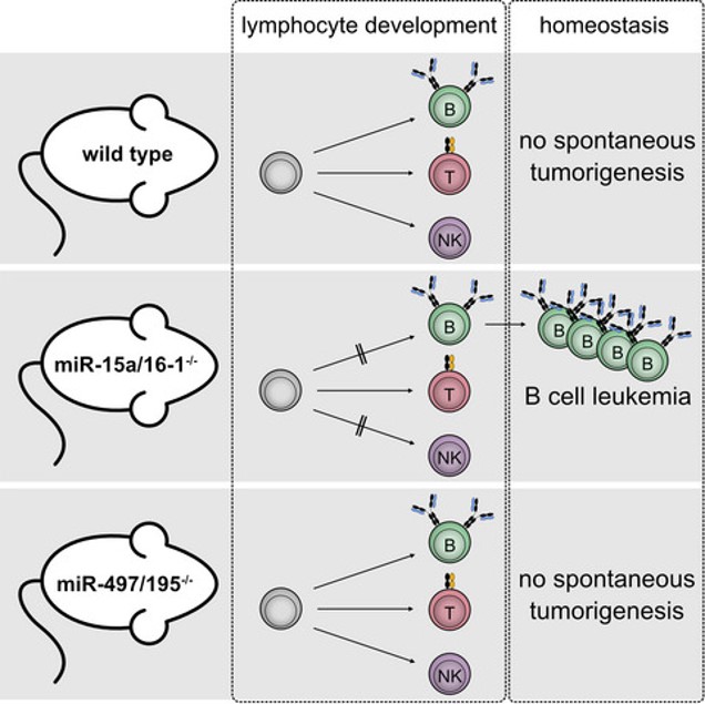
In this graphical abstract, the cartoons of the mice are immediately recognisable and only need to be labelled with the genotype. The reader will also immediately understand that the circles are cells.
FEBS J. 2020 Jul 23. doi: 10.1111/febs.15493. Online ahead of print. Differential roles of miR-15a/16-1 and miR-497/195 clusters in immune cell development and homeostasis. Katharina Hutter, Thomas Rülicke, Mathias Drach, Lill Andersen, Andreas Villunger, Sebastian Herzog. Link to graphical abstract
3. Focus on a single key point
Your paper may be complex, but your graphical abstract should be as simple as possible!
i) Focus on one key point. If you had to explain your most important findings in 15 seconds, what would you say? That description should be the blueprint for your graphical abstract. Don’t try to recreate your entire paper as a series of complex hieroglyphics.
ii) Stick to your own findings. Don’t try to explain the background to your work – there isn’t space!
iii) Reduce clutter. Don’t include multiple unconnected elements all competing for the reader’s attention; there should be a clear visual focal point that draws the reader’s attention.
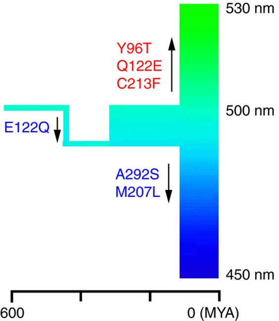
This graphical abstract distils the entire study into a simple cartoon, which shows evolutionary time along the horizontal axis and wavelength along the vertical axis and as a colour spectrum, and uses arrows to show how amino acid substitutions affect the maximum absorption of the pigment
FEBS Open Bio 2020 May;10(5):873-882. doi: 10.1002/2211-5463.12843. Epub 2020 Apr 11. Origin and adaptation of green-sensitive (RH2) pigments in vertebrates. Shozo Yokoyama, Huiyong Jia. Link to graphical abstract
4. Empty space is important
Resist the temptation to fill up every pixel with information! Empty space is not wasted space; it has a purpose – in fact, multiple purposes:
i) Reduce crowding. Spacing out the visual elements will make the image more attractive and help the reader absorb the relevant information.
ii) Prevent the reader from being overwhelmed. White space gives the eye somewhere to rest.
iii) Use space to group related items. The Law of Proximity states that objects that are near each other are perceived to be similar. To help the reader make sense of your graphical abstract, insert large gaps between different sections and smaller gaps between sub-sections.
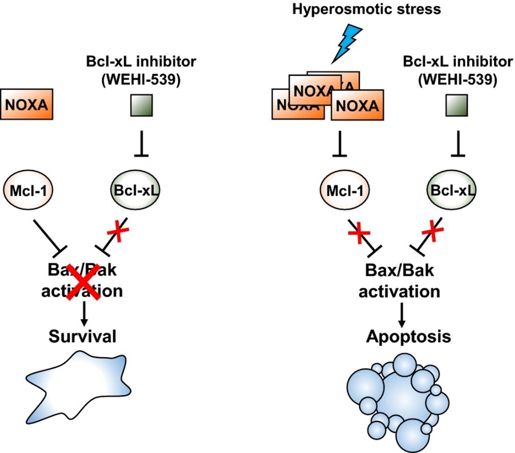
The white space above provides space for the eye to rest and clearly separates the cartoons representing two different cellular states.
FEBS J. 2020 Aug 31. doi: 10.1111/febs.15520. Online ahead of print. Linking hyperosmotic stress and apoptotic sensitivity. Daniela Stöhr, Markus Rehm. Link to graphical abstract
5. Move in the right direction
When telling a story, the order is important. Your graphical abstract is no different.
i) Move from left to right… English text is read from left to right. As such, most of your readers will automatically look at the top left of your graphical abstract first, so this is where you should put the first element of your story. If you decide to arrange all of your visual items in a single horizontal row, it should read from left to right.
ii) Or from top to bottom. Written English moves from left to right, and then from top to bottom. If you decide to arrange all of your visual items in a single vertical column, it should read from top to bottom.
iii) Use arrows to avoid ambiguity. If your graphical abstract has multiple elements running vertically and horizontally, the reader will be inclined to read first from left to right, and then move down to the next row. However, the reader may be unsure as to whether follow the elements in a clockwise direction or return to the left-hand side of the next row. To avoid any confusion, consider adding arrows to direct the reader’s gaze.
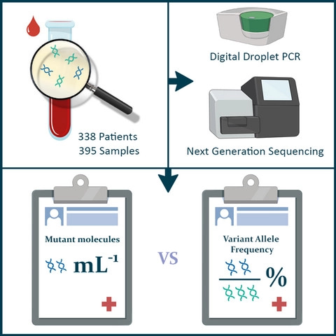
Note that this graphical abstract starts in the top-left hand corner, moves right and then down; the arrows reinforce the reader’s natural inclination to follow the image in this order.
Mol. Oncol. 2020 Oct 18. doi: 10.1002/1878-0261.12827. Online ahead of print. Comparison of variant allele frequency and number of mutant molecules as units of measurement for circulating tumor DNA. Manouk K Bos, Kazem Nasserinejad, Maurice P H M Jansen, Lindsay Angus, Peggy N Atmodimedjo, Evert de Jonge, Winand N M Dinjens, Ron H N van Schaik, Marzia Del Re, Hendrikus J Dubbink , Stefan Sleijfer, John W M Martens. Link to graphical abstract
Finishing up…
The tips above will improve any graphical abstract, but be sure to stick to the specific guidelines of the journal. Once you're familiar with the journal requirements, it is worth spending a few minutes perfecting your design on a piece of paper before you commit to creating it on the computer. The choice of software is a minor consideration – I prefer to use GIMP (a free graphics editor that is similar to Adobe Photoshop) as it provides a lot of useful tools, but there’s no reason an effective graphical abstract couldn’t be made in Microsoft Powerpoint (or even MS Paint!). Design is key.
(A final but very important point: if you decide to use stock images as part of your graphical abstract, ensure you receive permission to use them and credit the creator(s) in accordance with journal guidelines.)
Good luck with your next graphical abstract!
Top image of post: bodobe from Pixabay

Join the FEBS Network today
Joining the FEBS Network’s molecular life sciences community enables you to access special content on the site, present your profile, 'follow' contributors, 'comment' on and 'like' content, post your own content, and set up a tailored email digest for updates.
Great piece of work Duncan!
I am positive that young researchers will benefit from its concise yet beautifully stated content.
What I can add is that they should be careful about not including data items of any type; all the content should be in a graphical form. And the font used should better be a Sans Serif (12-16) for easy reading.
Thanks again for bringing up this important topic!
Ferhan Sagin
Thanks very much, Ferhan! I hope the post will make the task of creating a graphical abstract less daunting for our authors, and perhaps inspire them to create something truly eye-catching!
Thank you for your important points - I agree it is definitely worth emphasising that the graphical abstract should not be recycled from the data presented in the figures, as they serve completely different purposes.
Thanks for these insights, Duncan. Very helpful.
I have a comment on the first example image, regarding contrast: using red and green is commonly discouraged since they lack any contrast for some colour-blind people. One can see how they would look at http://shorturl.at/syEMN
Thank you Angel, that is also a really important consideration.