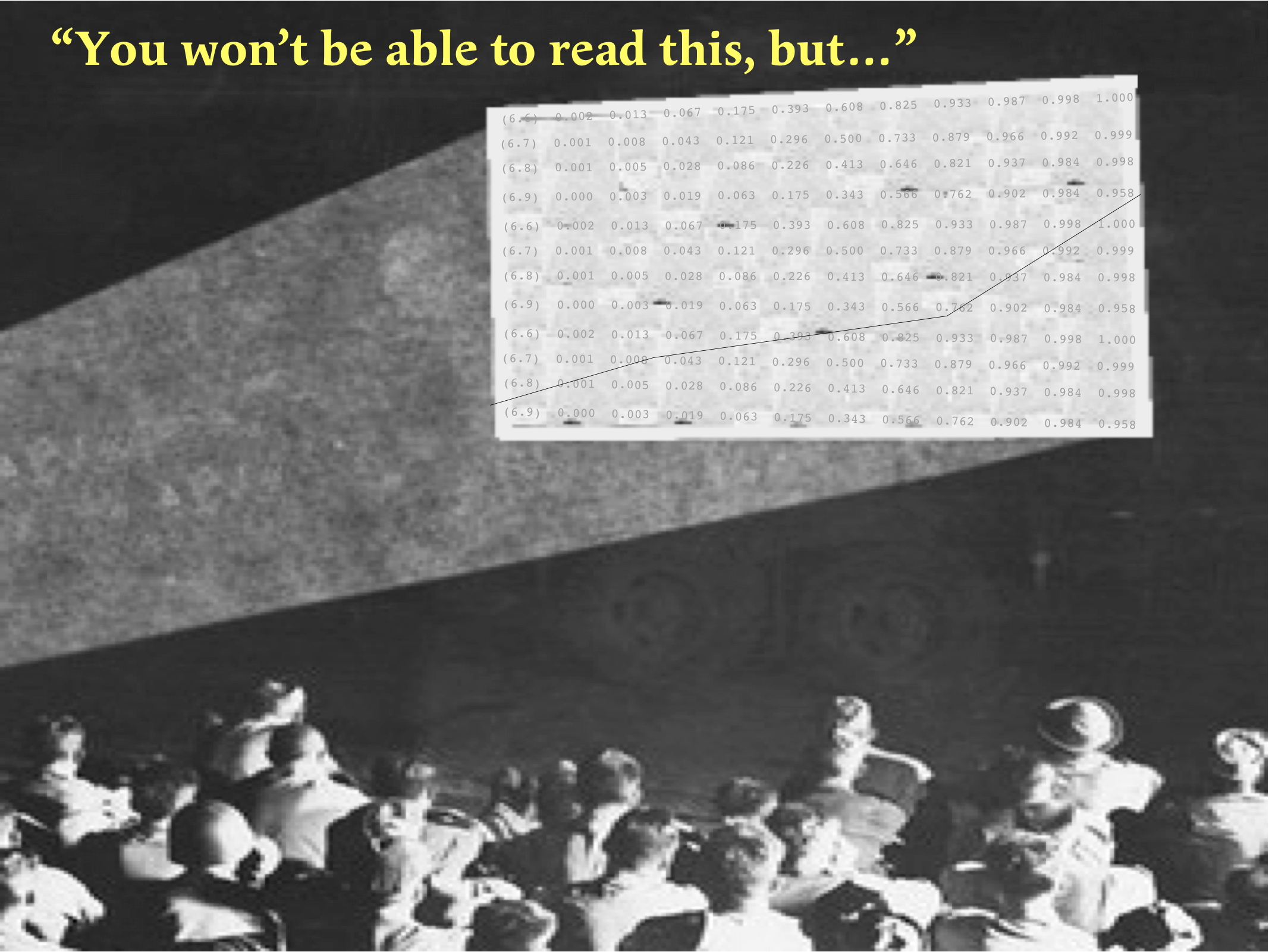
Many of today’s students will never have seen a lecture of the sort that was commonplace in the 20th century — slides cracked or dirty, upside down or back to front, jammed in the projector, or, probably the most common, showing a huge table of data, with many columns and many lines. When these last were shown the lecturer would usually say “You won’t be able to read this, but …”. Computer-driven presentations (Keynote, PowerPoint, PDF and others) have rid us of most of those horrors, but they have brought new ones to replace them, many associated with injudicious use of colour.
Contrasting colours. It seems obvious that it is not easy to read blue text on a purple background, but, obvious or not, presentations in which unsuitable colours have been chosen are not rare — just last week I saw one with yellow text on a white background. Less obviously, red on blue should be avoided because it can cause eye strain for the audience. In the early days I used to experiment with different colour schemes, but now I put nearly all my text in black on a white background, with exceptions only when I want to wake the audience up with a warning of some kind: then I might use yellow on a red background. In general, black on white is best, unless there is a real reason to use colour.
Colour variation. What the audience sees will not have the same colours as you see on your computer screen: even the best projectors distort the colours somewhat, as indeed do computer screens. It is essential, therefore, to check every presentation beforehand with a projector, if possible with the one that will be used for the lecture, and in the same room.
Large enough text. Make sure that any text that the audience needs to be able to read can be read from the back of the room. Text that is legible on your computer screen at a distance of 40 cm may be unreadable at a distance of 20 m. When checking your presentation it’s best (if possible) to use a remote control, so that you can change slides while sitting at the back.
Plug in your computer at least 15 minutes before the lecture. This may not always be possible, for example if the room is not available. I’ve often attended seminars by speakers who start connecting their computer at the moment the lecture is supposed to begin. Sometimes that works without problems, but not always, and then the audience have to spend ten or more minutes waiting for the lecture to begin.
Insist on projecting from your own computer. If you arrive with your presentation on a USB key, or if you are a junior scientist at a meeting where the organizers don’t allow you to use your own computer, that may not be possible; but even then you should check it on the one you have to use to see that everything looks the same. If you prepared it under MacOS and the computer provided runs Windows then it will not look the same (don’t believe people who tell you that it won’t make any difference: it’s not true, even today). Worse still, if you prepared it with Keynote but need to export it as PowerPoint so that it will run under Windows then it will certainly be different.
Don’t read out all your text. Everyone in your audience can read. They don’t need to have your sentences read out to them word by word. (I’m guilty of this myself sometimes, but I try to avoid it.)
You can fit vastly more information on a sheet of paper than you can on a slide. Edward Tufte (2006) would like to do away with slides altogether, but that is hardly possible in modern biochemistry lectures. However, one corollary of that is well worth following if your audience is not huge (fewer than 50, say): prepare hand-outs in sufficient quantities that everyone in the audience gets one. You will be surprised at how much of a lecture can be fitted on one double-sided sheet: I typically find that I can get all the important text from a 50-minute lecture, and all the important illustrations, on two sides, without making any of the text or images too small to be understood.
“You won’t be able to read this, but …”. You still hear this in lectures presenting sequence data. If there is just one essential point to be seen, for example that a series of proteins all have cysteine residues in homologous positions, then highlight the relevant residues, either by putting them in an easily visible colour, or by putting a rectangle in yellow behind them.
Do you really need a laser pointer? It is not really necessary to use a laser pointer at all (except in the question period) as it is usually more effective to put yellow rectangles behind the things to be highlighted, and these can be added and removed as the discussion of a particular slide proceeds. Moreover, unlike laser pointers in the hands of many speakers, they can be put exactly where you want them, not jiggling all over the screen, vaguely in the right places.
Add lines on graphs to label different curves. The unsatisfactory alternative is to use a key, which forces the audience to look somewhere other than the curves. Moreover, if you code different curves with different colours then a key that is perfectly clear on your computer screen may be unintelligible on the screen the audience sees, because colours are not reproduced accurately.
Red–green colour blindness. About 6% of men (and a much smaller proportion of women) have some degree of red-green colour blindness. So your choice of red to draw attention to important points will look green or grey to a significant number of men in the audience.
Reference
E. R. Tufte (2006) Beautiful Evidence, Graphics Press, Cheshire, Connecticut


Join the FEBS Network today
Joining the FEBS Network’s molecular life sciences community enables you to access special content on the site, present your profile, 'follow' contributors, 'comment' on and 'like' content, post your own content, and set up a tailored email digest for updates.
Thanks for these great hints on giving better presentations. I always enjoy yours since you mix perfectly a story (backed by the "tabel of contents" on one side of the slides) with educational elements, and the take home messages are very clear.
One could add at least another point to your list of dos and don'ts: display only those objects on your slide you are really talking about. Often seen, obviously hardly to avoid: overloaded slides with tons of graphics, sequence data, numbers, equations etc., which confuse the audience rather than teach it. Keep it simple and avoid distractions.
Looking forward to hearing your next talk.
Carsten has mentioned a point that I could have mentioned myself: "backed by the "table of contents" on one side of the slides". He is referring to the use of a stripe about 20% of the width of the slide to list the main topics, with the ones not being discussed on that slide greyed out. This allows the audience to gauge where they are in the whole presentation, and how much longer they're going to have to sit there. I didn't invent this myself: I saw it first in a doctoral presentation about 20 years ago by a student and decided to adapt it for my own use.
How do you grey out part of the text? The least laborious way is to cover the parts to be greyed out with rectangles of the same colour as the background with an opacity of about 40%. That avoids the need to do anything to the text itself.